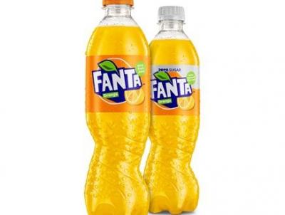
Out of Europe is the new visual identity features for Fanta Orange an innovative spiral bottle and a new recipe which contains a third less sugar.
Nearly two years in the making, the bottle is an industry-first, replacing traditional, symmetrical designs with a spiral version which twists the plastic to form a unique, eye-catching shape.
CCEP said driving the new look is a fresh new logo which was created using hand cut paper and transformed into a digital logo to depict movement and spontaneity.
Fanta’s personality is brought out by a hidden smile, and the iconic Fanta orange is highlighted by a new colour palette, which has been designed to create impact on shelf.
The logo also complements a fresh twist on the Fanta bottle.
Simon Harrison, operational marketing director at CCEP, said: “The evolution of Fanta is another example of how we’re energising our portfolio of leading brands to ensure they remain relevant to consumers whilst helping to drive sales for our retail customers.
“This year looks set to be the biggest in Fanta’s history, with a fresh new look inside and out and a multi-million pound investment support plan.”
| A packaging News release | March 26, 2017 |||


